
05.09.2017
Фотоаппарат на чистом CSS
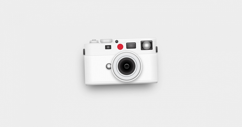
Возможности CSS безграничны — уже в который раз убеждаемся в этом на данном примере. Cassidy Williams сверстал очень крутой фотоаппарат на чистом HTML и CSS, что в очередной раз доказывает, что в вебе возможно все! Насладитесь и вы его работой.
<div class="demo-container">
	<div class="camera-container">
		<div class="camera-top">
			<div class="zoom"></div>
			<div class="mode-changer"></div>
			<div class="sides"></div>
			<div class="range-finder"></div>
			<div class="focus"></div>
			<div class="red"></div>
			<div class="view-finder"></div>
			<div class="flash">
				<div class="light"></div>
			</div>
		</div>
		<div class="camera-mid">
			<div class="sensor"></div>
			<div class="lens"></div>
		</div>
		<div class="camera-bottom"></div>
	</div>
</div>
.demo-container {
	display: block;
	position:relative;
	height: 400px;
}
.camera-container {
	position: absolute;
	top: 50%;
	left: 50%;
	transform: translate(-50%, -50%);
	border-radius: 5px;
	box-shadow: 0px 30px 50px -20px rgba(0, 0, 0, .7);
	animation: 5s angle infinite;
}

.camera-top, .camera-mid, .camera-bottom {
	width: 360px;
}

.camera-top {
	height: 60px;
	background: linear-gradient(
		to right,
		rgba(226, 226, 226, 1) 0%,
		rgba(245, 245, 245, 1) 10%,
		rgba(245, 245, 245, 1) 90%,
		rgba(226, 226, 226, 1) 100%
	);
	border: 1px solid #DCDCDC;
	border-top-left-radius: 5px;
}
.camera-top:before {
	display: block;
	content: '';
	position: absolute;
	top: -20px;
	right: 0;
	width: 210px;
	height: 20px;
	background: linear-gradient(
		to right,
		rgba(245, 245, 245, 1) 0%,
		rgba(245, 245, 245, 1) 174px,
		rgba(226, 226, 226, 1) 100%
	);
	border: 1px solid #DCDCDC;
	border-top-left-radius: 5px;
	border-top-right-radius: 5px;
	border-bottom: none;
	box-shadow: inset 0 15px 15px -15px #FDFDFD;
}
.camera-top .zoom {
	position: absolute;
	top: -15px;
	left: 30px;
	width: 42px;
	height: 9px;
	background: linear-gradient(
		to right,
		rgba(176, 176, 176, 1) 0%,
		rgba(226, 226, 226, 1) 30%,
		rgba(226, 226, 226, 1) 50%,
		rgba(226, 226, 226, 1) 70%,
		rgba(176, 176, 176, 1) 100%
	);
	border: 1px solid #A3A3A3;
	border-top-left-radius: 3px;
	border-top-right-radius: 3px;
	box-shadow: inset 0 15px 15px -15px #FDFDFD;
}
.camera-top .zoom:before {
	display: block;
	content: '';
	position: relative;
	top: -6px;
	left: 50%;
	transform: translateX(-50%);
	width: 20px;
	height: 4px;
	background: linear-gradient(
		to right,
		rgba(176, 176, 176, 1) 0%,
		rgba(226, 226, 226, 1) 50%,
		rgba(176, 176, 176, 1) 100%
	);
	border: 1px solid #A3A3A3;
	border-top-left-radius: 3px;
	border-top-right-radius: 3px;
}
.camera-top .zoom:after {
	display: block;
	content: '';
	position: relative;
	top: 3px;
	left: 50%;
	transform: translateX(-50%);
	width: 46px;
	height: 4px;
	background: linear-gradient(
		to right,
		rgba(176, 176, 176, 1) 0%,
		rgba(226, 226, 226, 1) 30%,
		rgba(226, 226, 226, 1) 50%,
		rgba(226, 226, 226, 1) 70%,
		rgba(176, 176, 176, 1) 100%
	);
	border: 1px solid #A3A3A3;
	border-bottom: none;
	border-top-left-radius: 3px;
	border-top-right-radius: 3px;
}
.camera-top .mode-changer {
	position: absolute;
	top: -20px;
	left: 82px;
	width: 60px;
	height: 16px;
	background: linear-gradient(
		to right,
		rgba(176, 176, 176, 1) 0%,
		rgba(226, 226, 226, 1) 30%,
		rgba(226, 226, 226, 1) 50%,
		rgba(226, 226, 226, 1) 70%,
		rgba(176, 176, 176, 1) 100%
	);
	border: 1px solid #A3A3A3;
	border-radius: 3px;
	box-shadow: inset 0 15px 15px -15px #FDFDFD;
}
.camera-top .mode-changer:after {
	display: block;
	content: '';
	position: absolute;
	top: 16px;
	left: 50%;
	transform: translateX(-50%);
	width: 50px;
	height: 2px;
	background: linear-gradient(
		to right,
		rgba(176, 176, 176, 1) 0%,
		rgba(226, 226, 226, 1) 30%,
		rgba(226, 226, 226, 1) 50%,
		rgba(226, 226, 226, 1) 70%,
		rgba(176, 176, 176, 1) 100%
	);
	border: 1px solid #A3A3A3;
	border-bottom: none;
}
.camera-top .sides {
	width: 100%;
}
.camera-top .sides:before, .camera-top .sides:after {
	display: block;
	content: '';
	position: absolute;
	top: 24px;
	width: 8px;
	height: 30px;
	background: linear-gradient(
		to bottom,
		rgba(130, 129, 129, 1) 0%,
		rgba(105, 103, 103, 1) 10%,
		rgba(79, 77, 77, 1) 50%,
		rgba(64, 62, 63, 1) 100%
	);
	border: 1px solid #3E3C3D;
	border-radius: 2px;
	box-shadow: 0px 3px 5px -1px rgba(0, 0, 0, .5);
}
.camera-top .sides:before {
	left: -4px;
	border-top-left-radius: 3px;
	border-bottom-left-radius: 3px;
}
.camera-top .sides:after {
	right: -4px;
	border-top-right-radius: 3px;
	border-bottom-right-radius: 3px;
}
.camera-top .range-finder {
	position: absolute;
	top: 10px;
	left: 105px;
	width: 30px;
	height: 20px;
	background: #3E3C3D;
	border-radius: 3px;
	box-shadow: inset 0 0 5px 3px #333132;
}
.camera-top .range-finder:before {
	display: block;
	content: '';
	position: absolute;
	top: 50%;
	left: 50%;
	transform: translate(-50%, -50%);
	width: 12px;
	height: 12px;
	background: #797878;
	border-radius: 100%;
}
.camera-top .focus {
	position: absolute;
	top: -14px;
	left: 156px;
	width: 15px;
	height: 15px;
	background: #3F3D3E;
	border-radius: 100%;
	box-shadow: inset 0 0 4px 3px #2D2B2B,
		inset 0 4px 5px 0 #F5F5F5,
		inset 0 -3px 4px -2px #A3A2A2;
}
.camera-top .red {
	position: absolute;
	top: 5px;
	left: 165px;
	width: 30px;
	height: 30px;
	background: #DC2839;
	border-radius: 100%;
}
.camera-top .view-finder {
	position: absolute;
	left: 210px;
	width: 48px;
	height: 30px;
	background: radial-gradient(
		ellipse at center,
		rgba(130, 129, 129, 1) 0%,
		rgba(64, 62, 63, 1) 85%,
		rgba(64, 62, 63, 1) 100%
	);
	border: 3px solid #312F2F;
	border-radius: 4px;
	box-shadow: inset 0 8px 8px -8px #FDFDFD;
}
.camera-top .flash {
	position: absolute;
	top: -6px;
	right: 20px;
	width: 58px;
	height: 46px;
	background: radial-gradient(
		ellipse at center,
		rgba(130, 129, 129, 1) 0%,
		rgba(64, 62, 63, 1) 70%,
		rgba(64, 62, 63, 1) 100%
	);
	border: 2px solid #312F2F;
	border-radius: 3px;
	box-shadow: inset 0 8px 8px -8px #FDFDFD;
}
.camera-top .flash:before, .camera-top .flash:after {
	display: block;
	content: '';
	position: absolute;
	top: 50%;
	left: 50%;
	transform: translate(-50%, -50%);
}
.camera-top .flash:before {
	width: 90%;
	height: 70%;
	background: radial-gradient(
		ellipse at center,
		rgba(105, 103, 103, 1) 0%,
		rgba(30, 30, 30, 1) 50%,
		rgba(30, 30, 30, 1) 100%
	);
}
.camera-top .flash:after {
	width: 16px;
	height: 14px;
	background: #797979;
	border-top-left-radius: 8px 2px;
	border-top-right-radius: 8px 2px;
	border-bottom-left-radius: 8px 2px;
	border-bottom-right-radius: 8px 2px;
}
.camera-top .flash .light {
	position: absolute;
	top: 50%;
	left: 50%;
	transform: translate(-50%, -50%);
	width: 20px;
	height: 20px;
	background: radial-gradient(
		ellipse at center,
		rgba(255, 255, 255, 1) 0%,
		rgba(255, 255, 255, 0) 100%
	);
	border-radius: 100%;
	z-index: 2;
	animation: 1s flash infinite;
}

.camera-mid {
	position: relative;
	height: 130px;
	background: linear-gradient(
		to right,
		rgba(228, 228, 228, 1) 0%,
		rgba(250, 250, 250, 1) 10%,
		rgba(250, 250, 250, 1) 90%,
		rgba(228, 228, 228, 1) 100%
	);
	border: 1px solid #DCDCDC;
	border-top: none;
	border-bottom: none;
	box-shadow: inset 0 15px 15px -15px #FDFDFD;
}
.camera-mid .sensor {
	position: absolute;
	top: 40px;
	left: 105px;
	width: 30px;
	height: 30px;
	background: #545252;
	border: 2px solid #545252;
	border-radius: 100%;
	box-shadow: inset 0 12px 12px -10px #FDFDFD,
		0 2px 5px 1px rgba(0, 0, 0, .3);
}
.camera-mid .sensor:before, .camera-mid .sensor:after {
	display: block;
	content: '';
	position: absolute;
	top: 50%;
	left: 50%;
	transform: translate(-50%, -50%);
}
.camera-mid .sensor:before {
	width: 20px;
	height: 20px;
	background: linear-gradient(to bottom, #E9E9E9 0%, #BDBDBD 100%);
	border-radius: 100%;
}
.camera-mid .sensor:after {
	width: 12px;
	height: 12px;
	background: #FAFAFA;
	border-radius: 100%;
	box-shadow: 0 2px 3px 0 #747474;
}
.camera-mid .lens {
	position: absolute;
	top: -20px;
	left: 130px;
	width: 155px;
	height: 155px;
	background: radial-gradient(
		ellipse at center,
		rgb(0, 0, 0) 0%,
		rgb(0, 0, 0) 15%,
		rgb(39, 37, 37) 30%,
		rgb(64, 62, 63) 30%,
		rgb(64, 62, 63) 31%,
		rgb(64, 62, 63) 40%,
		rgb(233, 235, 236) 41%,
		rgb(233, 235, 236) 44%,
		rgb(176, 177, 178) 48%,
		rgb(232, 233, 234) 50%,
		rgb(232, 233, 234) 60%,
		rgb(247, 248, 248) 60%,
		rgb(120, 121, 121) 65%,
		rgb(255, 255, 255) 66%,
		rgb(255, 255, 255) 100%
	);
	border: 1px solid #B6B7B8;
	border-radius: 100%;
	box-sizing: border-box;
	box-shadow: 0 7px 15px -2px rgba(0, 0, 0, .4),
		inset 0 -2px 15px -2px rgba(0, 0, 0, .2),
		inset 0 7px 15px -2px #FFF;
}
.camera-mid .lens:before {
	display: block;
	content: '';
	position: absolute;
	top: 50%;
	left: 50%;
	transform: translate(-50%, -50%);
	width: 25px;
	height: 25px;
	background: rgba(0, 0, 0, .7);
	border-radius: 100%;
	box-shadow: inset 0 5px 3px -2px rgba(255, 255, 255, .5),
		inset 0 -5px 20px -8px rgba(255, 255, 255, .5);
}

.camera-bottom {
	height: 16px;
	background: linear-gradient(
		to right,
		rgba(226, 226, 226, 1) 0%,
		rgba(245, 245, 245, 1) 10%,
		rgba(245, 245, 245, 1) 90%,
		rgba(226, 226, 226, 1) 100%
	);
	border: 1px solid #DCDCDC;
	border-bottom: none;
	border-bottom-left-radius: 5px;
	border-bottom-right-radius: 5px;
	box-shadow: inset 0 15px 15px -15px #FDFDFD, inset 0 -12px 12px -10px #797979;
}

@keyframes flash {
	0% {
		width: 0;
		height: 0;
	}
	20% {
		width: 200px;
		height: 200px;
	}
	25% {
		width: 0;
		height: 0;
	}
	45% {
		width: 200px;
		height: 200px;
	}
	50% {
		width: 0;
		height: 0;
	}
	100% {
		width: 0;
		height: 0;
	}
}

@keyframes angle {
	0% {
		transform: translate(-50%, -50%) rotate(0deg);
		box-shadow: 0px 30px 50px -20px rgba(0, 0, 0, .7);
	}
	25% {
		transform: translate(-50%, -50%) rotate(2deg);
		box-shadow: 10px 30px 50px -20px rgba(0, 0, 0, .7);
	}
	75% {
		transform: translate(-50%, -50%) rotate(-2deg);
		box-shadow: -10px 30px 50px -20px rgba(0, 0, 0, .7);
	}
	100% {
		transform: translate(-50%, -50%) rotate(0deg);
		box-shadow: 0px 30px 50px -20px rgba(0, 0, 0, .7);
	}
}
Демонстрация
Нам будет приятно
Поделитесь
Комментарии