
02.09.2017
Анимированный прелоадер на чистом СSS
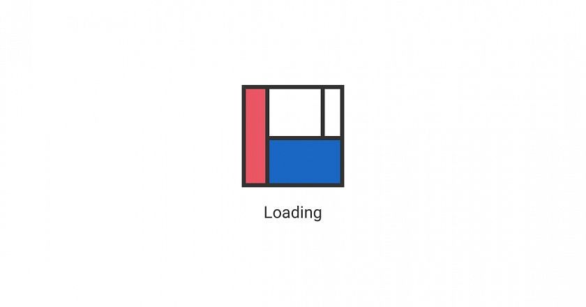
Часто необходимо сделать для сайта или какого то элемента загрузку в фоне и для этого нужно использовать прелоадер, который будет отображать процесс загрузки.
Необычный вариант такого прелоадера предложил Julien Benchetrit / Подробнее.
Такой прелоадер использует исключительно CSS и ничего более, а выглядит оригинально и в виде сетки сайта, которую можно сделать под свой сайт.
<div class="site-container">
	<div class="loader">
		<div class="logo">
			<div class="white"></div>
			<div class="orange"></div>
			<div class="red"></div>
		</div>
		<p>Loading</p>
	</div>
</div>
/* Этот код для примера */
.site-container {
	position: relative;
	height: 300px;
	width: 100%;
}
/* Далее код прелоадера */
.loader {
	position: absolute; /* Заменить на fixed, чтобы прелоадер был на весь экран */
	top: 0;
	left: 0;
	right: 0;
	bottom: 0;
	background-color: #fff;
	display: flex;
	flex-direction: column;
	justify-content: center;
	align-items: center;
	z-index: 100;
}
.loader p {
	margin: 1em 0 0 0;
	font-size: 16px;
}
.logo {
	width: 100px;
	height: 100px;
	box-sizing: border-box;
	position: relative;
	background-color: white;
}
.logo::before,
.logo::after {
	z-index: 1;
	box-sizing: border-box;
	content: '';
	position: absolute;
	border: 4px solid transparent;
	width: 0;
	height: 0;
	animation-direction: alternate;
	animation-timing-function: linear;
}
.logo::before {
	top: 0;
	left: 0;
	animation: border-before 1.5s infinite;
	animation-direction: alternate;
}
.logo::after {
	bottom: 0;
	right: 0;
	animation: border-after 1.5s infinite;
	animation-direction: alternate;
}
.logo > div {
	position: absolute;
	opacity: 0;
}
.white {
	border-left: 4px solid #333;
	top: 0;
	bottom: 0;
	right: 0;
	width: 0;
	animation: white 1.5s infinite;
	animation-direction: alternate;
}
.orange {
	border-top: 4px solid #333;
	left: 0;
	bottom: 0;
	right: 0;
	height: 0;
	background-color: #1967c3;
	animation: orange 1.5s infinite;
	animation-direction: alternate;
}
.red {
	border-right: 4px solid #333;
	top: 0;
	bottom: 0;
	left: 0;
	width: 0;
	background-color: #EA5664;
	animation: red 1.5s infinite;
	animation-direction: alternate;
}
@keyframes border-before {
	0% {
		width: 0;
		height: 0;
		border-top-color: #333;
		border-right-color: transparent;
	}
	12.49% {
		border-right-color: transparent;
	}
	12.5% {
		height: 0;
		width: 100%;
		border-top-color: #333;
		border-right-color: #333;
	}
	25%,
	100% {
		width: 100%;
		height: 100%;
		border-top-color: #333;
		border-right-color: #333;
	}
}
@keyframes border-after {
	0%,
	24.99% {
		width: 0;
		height: 0;
		border-left-color: transparent;
		border-bottom-color: transparent;
	}
	25% {
		width: 0;
		height: 0;
		border-left-color: transparent;
		border-bottom-color: #333;
	}
	37.49% {
		border-left-color: transparent;
		border-bottom-color: #333;
	}
	37.5% {
		height: 0;
		width: 100%;
		border-left-color: #333;
		border-bottom-color: #333;
	}
	50%,
	100% {
		width: 100%;
		height: 100%;
		border-left-color: #333;
		border-bottom-color: #333;
	}
}
@keyframes red {
	0%,
	50% {
		width: 0;
		opacity: 0;
	}
	50.01% {
		opacity: 1;
	}
	65%,
	100% {
		opacity: 1;
		width: 27%;
	}
}
@keyframes orange {
	0%,
	65% {
		height: 0;
		opacity: 0;
	}
	65.01% {
		opacity: 1;
	}
	80%,
	100% {
		opacity: 1;
		height: 50%;
	}
}
@keyframes white {
	0%,
	75% {
		width: 0;
		opacity: 0;
	}
	75.01% {
		opacity: 1;
	}
	90%,
	100% {
		opacity: 1;
		width: 23%;
	}
}
Демонстрация
Loading
Нам будет приятно
Поделитесь
Комментарии